Upload your data
Start with CSV, Excel, or Parquet files from the work your team already tracks.
No-code machine learning for business data
Upload CSV, Excel, or Parquet data, describe what you want to understand, and use SaborData to review analysis setup, model results, metrics, plots, and predictions without writing code.
Use results to compare patterns and support decisions; SaborData does not guarantee business outcomes.
Workflow
SaborData keeps the path from file to analysis visible, so business teams can understand each step before they use results.
Start with CSV, Excel, or Parquet files from the work your team already tracks.
Use a plain-language goal to say what you want to understand, forecast, classify, or segment.
SaborData reviews your columns and prepares a structured analysis setup for you to confirm.
The real app runs the analyzer, trains models, and prepares metrics and plots for review.
Compare model results, then use the trained model for predictions when the results support your decision process.
Supported analysis
Bring familiar business data formats and choose analysis types through plain examples instead of machine learning code.
Example results
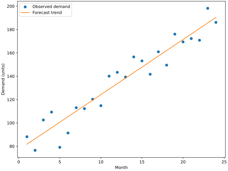
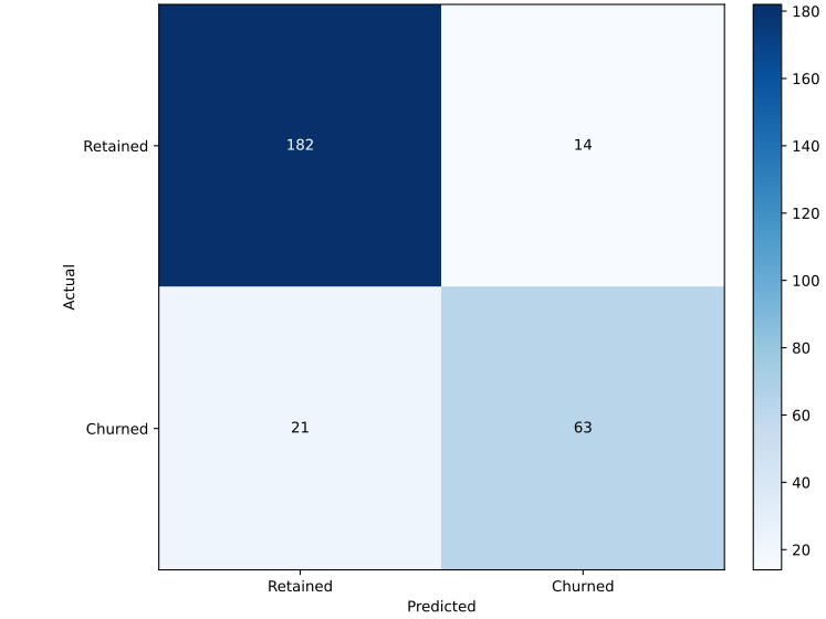
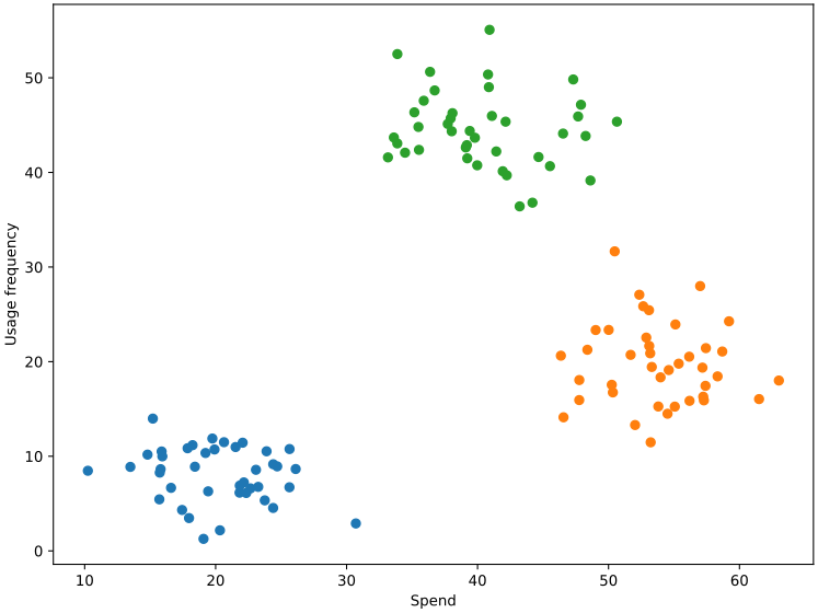
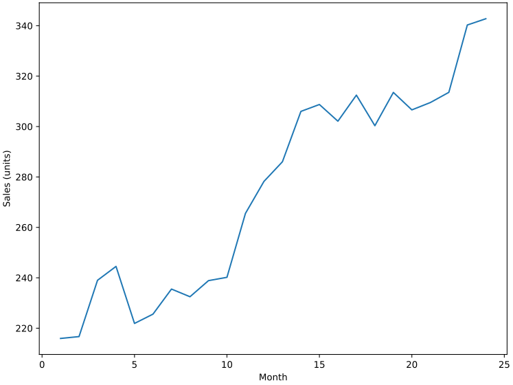
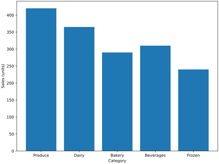
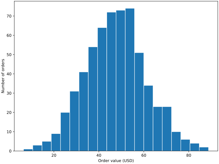
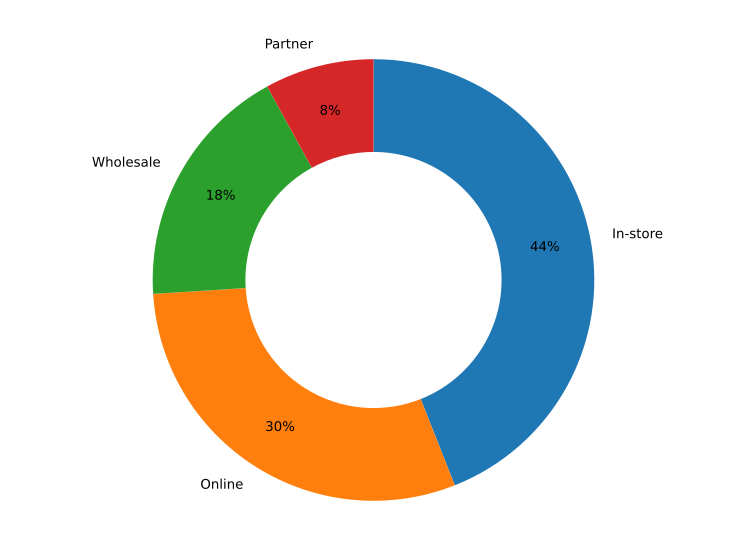
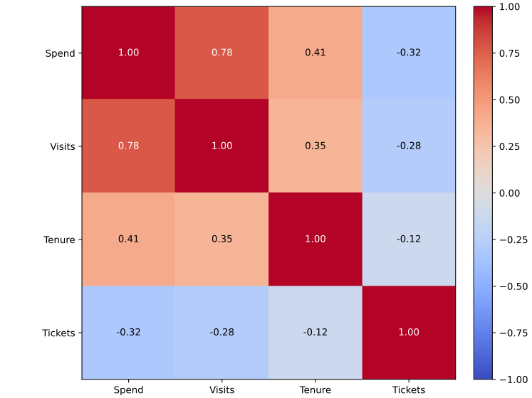
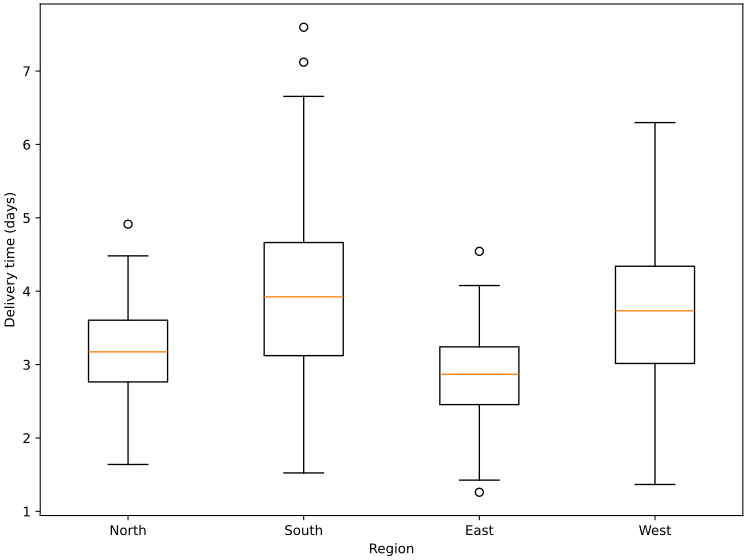
These illustrative charts show the analysis types above in action — forecasts, classifications, segments, trends, distributions, comparisons, and correlations rendered from sample business data.
Use cases
Use historical rows to estimate what may happen next month or next period.
Review likely churn, renewal, or lead outcomes from the columns you already collect.
Group similar records by behavior, usage, spend, or operational patterns.
Explore changes across time so teams can compare patterns before acting.
Start in the app
Review the setup and results before using them to support decisions.